Friday, March 12, 2010

Everyone Loves Web Animation!!

We see animations on the websites almost everyday. However, we really don't know about the history of web animation and what types of technologies there are.

In August 1995, Adobe began to add animation to SmartSketch, which was firstly a vector- based drawing program for pen-based computers. However, at the time, there was only one way to extend a web browser to play back animation through Java, and it was really slow. However, Netscape or web browsers appeared with plug-in API which made it quickly to play. Disney Online was using FutureSplash to build animation, and they also were working with Macromedia Shockwave. Therefore, Microsoft adopted the technology of FutureSplash since they wanted to add animation to their product in August 1996. Later on, they started running FutureWave and it became Macromedia Flash in November 1996.

There are four types of technologies to create animation:
  1. Animated GIFs,
  2. Dynamic HTML,
  3. Java Applet,
  4. Shockwave and Flash


Animated GIFs
or GIF89 that we have done in class is one of the biggest advan
ces to combine photos and other graphic with text on the web. The image comes with the form of "bitmap files" which describes the color of each pixel in the image. Therefore, users have to compress the image data to change either JPEG or GIF. The advantage of GIF animation is it's easy and it's automatically recognizable to web browser. The disadvantage is that users have to keep the animation super simple to keep the file size down so Animated GIFs are quite limited.
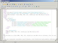


Dynamic HTML or dHTML is used when users create a movie of any larger length or games. During 1990s and early 2000s, a number of computer games were created by using dHTML. It also allows to chance once the user already download a particular web page. dHTML script can tell the browser to change the placement of a particular image on the page; therefore, it moves around the screen. By changing dHTML script allows to make a movie. However, it is also limited in its animation uses because it only can move still images around on the screen.


Java is the programming language and able to only run in the web browser. It allows playing online games, chatting with people around the world, and viewing images in 3D. Many web animation designers create with "applets" which is small programs in any application. Java is perfect for creating interactive animations and combining animation with other web page element.


Shockwa

ve and Flash or SWF is under the control of Adobe. SWF files can include animations, and display animated vector graphics, especially 2D animation on the web.


*Links*

Tuesday, March 2, 2010

**Assignment #4--Animated GIF**


My assignment #4 was Animated GIF. Basically, I had to combine my Font Poem and Post Card together. I was hoping to achieve to flow smoothly (font poem to post card.)

This one was fun to create that how fast each my word shows up. I was enjoying to create each slides by animation tool. However, I was struggling to put my Post Card on my Font Poem; although, I could put it on it came out smaller. Also, the words did not show when I posted it. Therefore, I was having extra time with Prof. O'Connell to put this GIF on the blog, and the words showed up successfully.

The process of making this took me lots of time to move each word (how much space there should be, think about the balance, and etc...) and how fast it should be.
I really enjoyed with this project and I loved it!!!

Monday, March 1, 2010

**Assignment #3--Animated Post Card


I just checked my blog and it has been as draft... not good... I am really sorry about that...

My assignment #3 was Animated Post Card. I had to choose at least 3 images and use photo shop to put all images together as see through. I was hoping to achieve my creativity and how these images connect to my Font Poem.

I chose 4 images. My hometown sunset picture as the background, the hands image as holding the sun and represents as “To HAVE” from my Font Poem, a guy image which is top on the mountain as being succeed and happy and represents as “To BELIEVE” from my Font Poem, the butterfly which is right next to the hands, and the lip represents “To LIKE” from my Font Poem. And finally, all images got together represent “CONFIDENCE.” I decided to choose color BLUE because when I tried to choose red or yellow the sun was almost disappeared so I chose opposite color which is blue.

I thought this assignment would be difficult; however, it was actually not that harder than I thought after I started creating. I used the tools, cropping, erasing, and etc… Now I figured out how to make post card, and I would like to create another one if I have time. I really enjoyed this assignment and I am very happy that my post card came out really clearly and nicer than I thought. I am proud of creating each image without square box, which looks more clearly. If I had more time, I would add more images and make it colorful.

**Assignment #2--Font Poem**

My chosen quote is from my mom’s saying. I chose this quote because whenever we discuss about my life and future and she always tells me an important thing even the basic things. Although, this quote looks simple but it has deep meaning for me because my mom told me this quote right before I left my country for studying abroad. Therefore, I always remind myself this quote when I am in bad mood or stressed.

I chose seven founts which are listed below;

Cooperblack

Handwriting/Dakota

Impact

Curlz

Lucidahand writing

Rockwellextrobold

Didot

Since this quote is really meaningful for me, I decided not to use fancy fonts. Instead of fancy fonts, I used the bold font, Cooper black for “HAVE”, “LIKE”, “BELIEVE”, “3”, and “CONFIDENCE” because these four words are important words in this quote, and this font makes words bigger and clearly. I actually used one fancy font, Curlz for “important things” because I use similar font on AIM. For the word “lead,” I used cool font, Lucida hand writing because of this font makes whole quote not childish. For lest of the words, I used thin and handwriting style, which is Handwriting/Dakota. The name’s font is I did not want to arrange too much with my words, just keep it simple!

I was having fun with this assignment because changing fonts is always fun; however, choosing fonts took so much time because there are tons of fonts in photo shop. I had trouble to move the words but I figured out to find the tool.

If I had more time, I would add colors but with different quote. If I could not use colors, I would stick with this quote and change the words’ size. I am pretty proud of this assignment because I did not have any huge problems. I am pretty happy with my Font Poem. I am going to print it out and send it to my mom!!!

**Assignment #1--Contact Sheet**


The first assignment was the contact sheet. This was my first time to use photo shop before this class so I was anxious about this assignment. However, Prof. O’Connell explained step by step and working with us really helped to understand clearly. I also noticed how important to take notes in this class. I was hoping to get used to using photo shop and Mac because I have been using PC since I bought the first one.

My challenge was to work on this by myself. When I was working it in this class, I could ask the professor or classmates but working myself was totally different because no one could tell me what is right or wrong. However, there are instructions and the online book calls “Digital Foundations” on the black board and they were really helpful. And actually my hands still remembered the steps and where to click to zoom in and out, change the dpi and size, which I was proud of.

I really enjoyed this assignment because finally I got a skill of using photo shop and leaned the ways to edit images. Therefore, I would like to use this skill outside of class too. I was also enjoying with row 1 (Resolution), row 2 (Format/Mode), and row 6 (Purpose). If I had more time, I would choose images carefully or go out to take pictures for this assignment.


Here is the close-up image of Resolution 1200 dpi below. It came out really clearly and this is my favorite!!