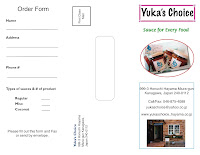
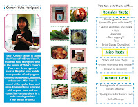
I also decided not use background color because I wanted the food photos to show up clearly and dynamic, and since making the "Order form" inside the brochure, it should be white.
One of the challenges was inside and outside part; however, the professor O’Connell taught us which number would be inside or outside briefly I could understand it quickly. The second challenge was gathering the photos. My mother has only few pictures of her products so it was tough to arrange the brochure; however, using the photos of foods showed how to use the product with. The third challenge was making spaces between panels. Because I had to hold it after print it out, there should be equal spaces and I did not know how to measure, but using the box made measuring was easier. The last challenge was creating the stamp exactly, and I could not figure it out last minute. Also, the other students could not figure it out; therefore, we did it together in class. Copy and Paste the picture of stamp in the picture box, and click "fit in the box."
I really enjoyed this project since I already used QuarkXPress. I enjoyed how to arrange the whole brochure, I showed the other people to ask that it is clear to read, catch the audiences eyes, and using colors, and then I fix it again and again. I am really proud of arranging, using the colors, and lines. If I had more time, I would us the PhotoShop to make the pictures more clearly


I hope my mother will like it!!!


